P.s. Logo Project
My project was to create a new personal logo. Unfortunately, I just did a complete rebrand of Ps Photography that I really like so this project felt a little repetitive, but it turned out to be fun.
The instructions were to start designing my logo on paper and move into Illustrator when I was happy with a few designs. I needed feedback on the designs and then once I picked one I could refine it.
The refining part got a little crazy and I created something that doesn’t really resemble my initial pick. But I actually do like what I came up with in the end!
Sketches


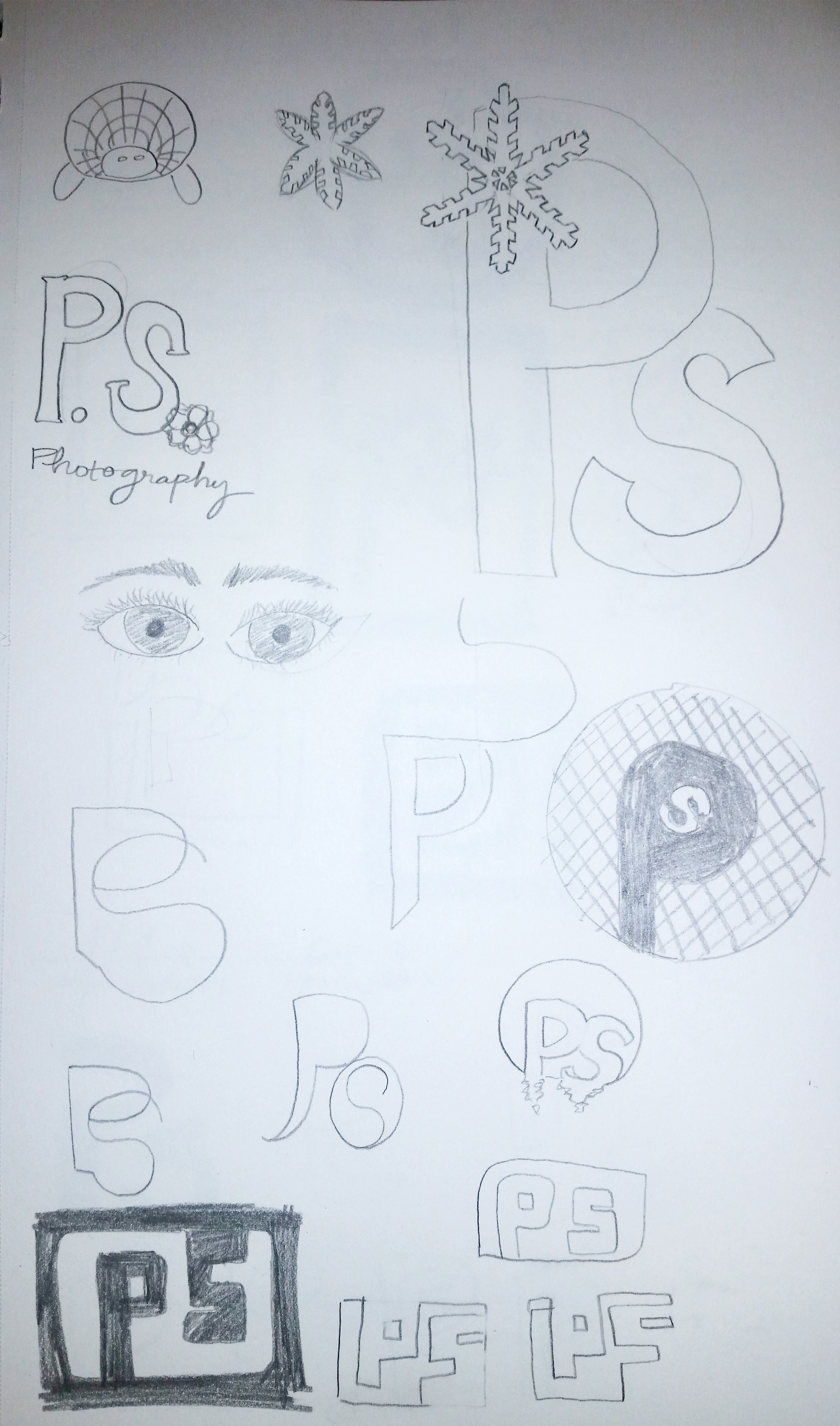

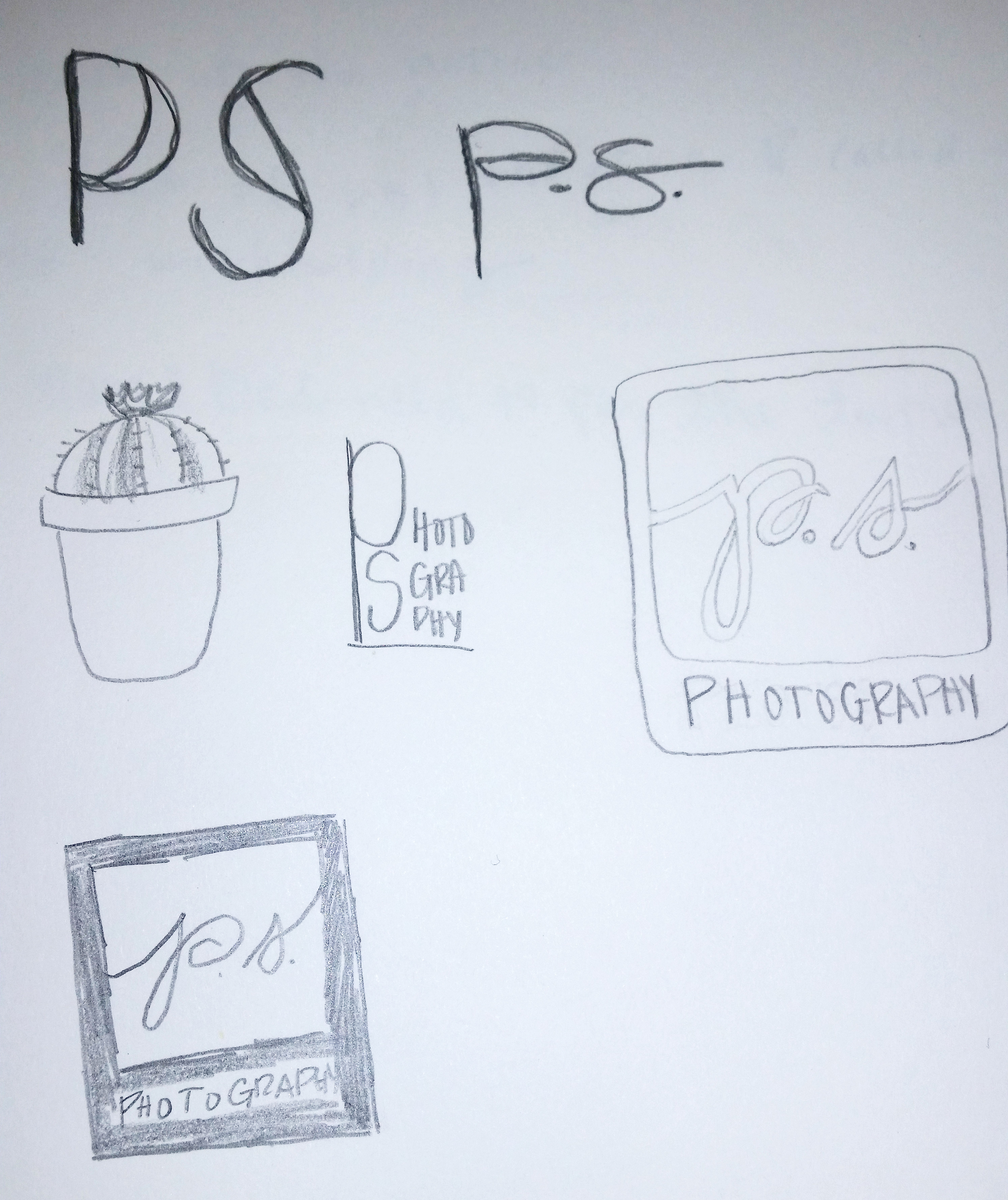
I’m going to be honest; I do not love sketching. I wish I did but I feel like this is where I am the least creative. Or, where my creativity is the most ugly! Once I get on the computer I am able to visualize a little bit better and see what works and what doesn’t.
Vectorized Concepts
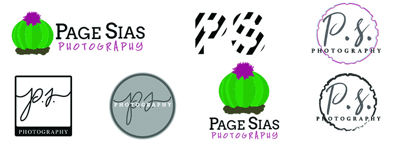
I created a few of the sketches that I didn’t hate and began messing with a few of them, adding color and changing up the design.
The favorite of those who have seen them is the cactus. It’s cute, but I went with another option for a couple of reasons. One is that I’m not an Illustrator genius, I’m learning Illustrator right now and want to come back to this logo later to see what I can improve upon. My second reason for passing this one up is because the text looks so much better as Page Sias Photography than it does as PS Photography and I want to make sure the P.s. is there.
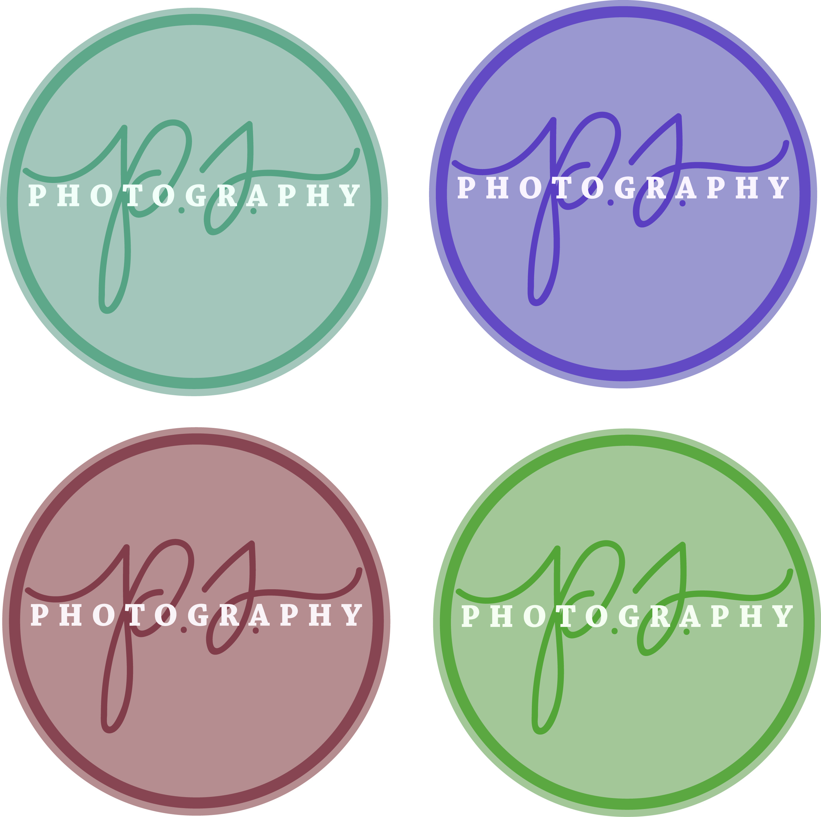
The First Design Pick
I went with a circular design that was simple and actually was the one that took me the longest to get right. I started out with a square for this idea and remade it into a circle and everything fit so much better. The rounded square I started out with looked okay but it didn’t flow with my P.S. I decided a circle might fit with better with the curved design. I was right.
The Adobe Kuler wheel helped me realize that I wanted to use a monochromatic color scheme for this logo.
Refining the Design
I had decided on a simple, teal logo with a personal touch from the hand-written p.s. to use as my initial design. I didn’t love it but I was just at a loss for what else to do. To me it seemed boring and predictable. But no matter what I tried, it just looked worse as I went on.

The first thing that helped me figure out what to do was to ask for opinions. People gave me such wonderful pointers that I immediately tried to see if they would help. Many of them did and I’m so glad that I tried them. Something else that was important that got me out of the funk was that I took some time away. Stepping back from the project and coming back to it a few days later helped me see the weak parts of the project. I got online and looked at logos I liked and didn’t like, what they had in common, and what I could do to make a concept my own.
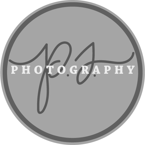
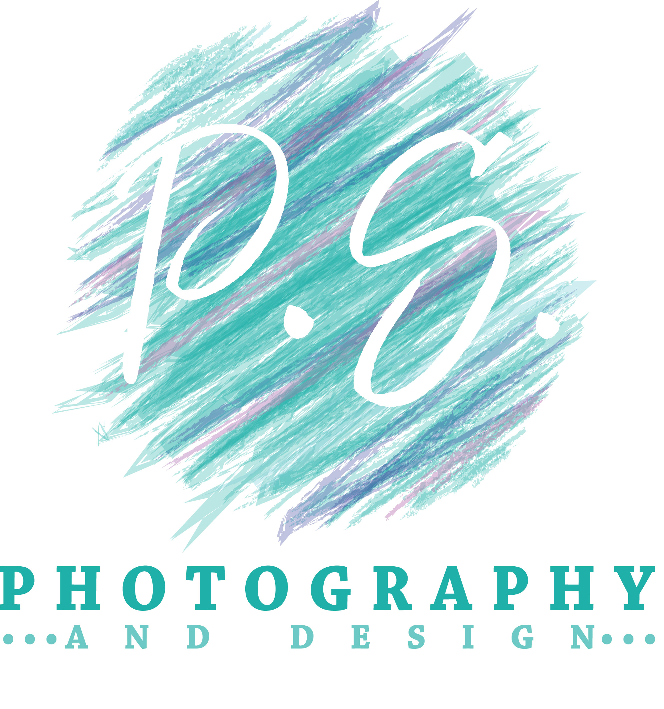
The Finished Product
That’s when I got back on Illustrator, newly inspired and ready to try again. I transformed my circle into a teal mess of lines and lowered their opacity to show detail. I then brought in white text on my white background to act as a cut out for my P.S. I used my “photography” font from the previous design and added in a bit more text. That’s when it all came together. I added in a couple more cool colors to give it an analogous color scheme and it was finished!
Hi Page,
I really like your teal PS logo! I love the color and think starting the s with a dot is super creative! I also agree with your decision to go with the the circle design better than the square! It’s classy and stylish! I reallY, REALLY love your handwritten ps. Plus, I think it’s a little easier on the eye because the “photography” is below your ps. Anyway, SUPER job!
Love
Mom
Now that you are a master (mistress?) logo designer, you should work on one for my wood working stuff! – Alan