A tasteful package redesign of a product that needed a face lift.
Finding my Product
These past couple of weeks I have been working on a package redesign project. My goal was to redesign the packaging of a product that I felt could use a facelift. When I was brainstorming which product to redesign, I originally thought of NeilMed Nasal Rinse. The packaging is just gross and super crowded. But a day or two later I was in the lotion and soap aisle at the grocery store and I found something hideous – a 99 cent cocoa butter lotion in the most unattractive bottle possible. -Yes, I am definitely exaggerating- Below is a photo of the original bottle.
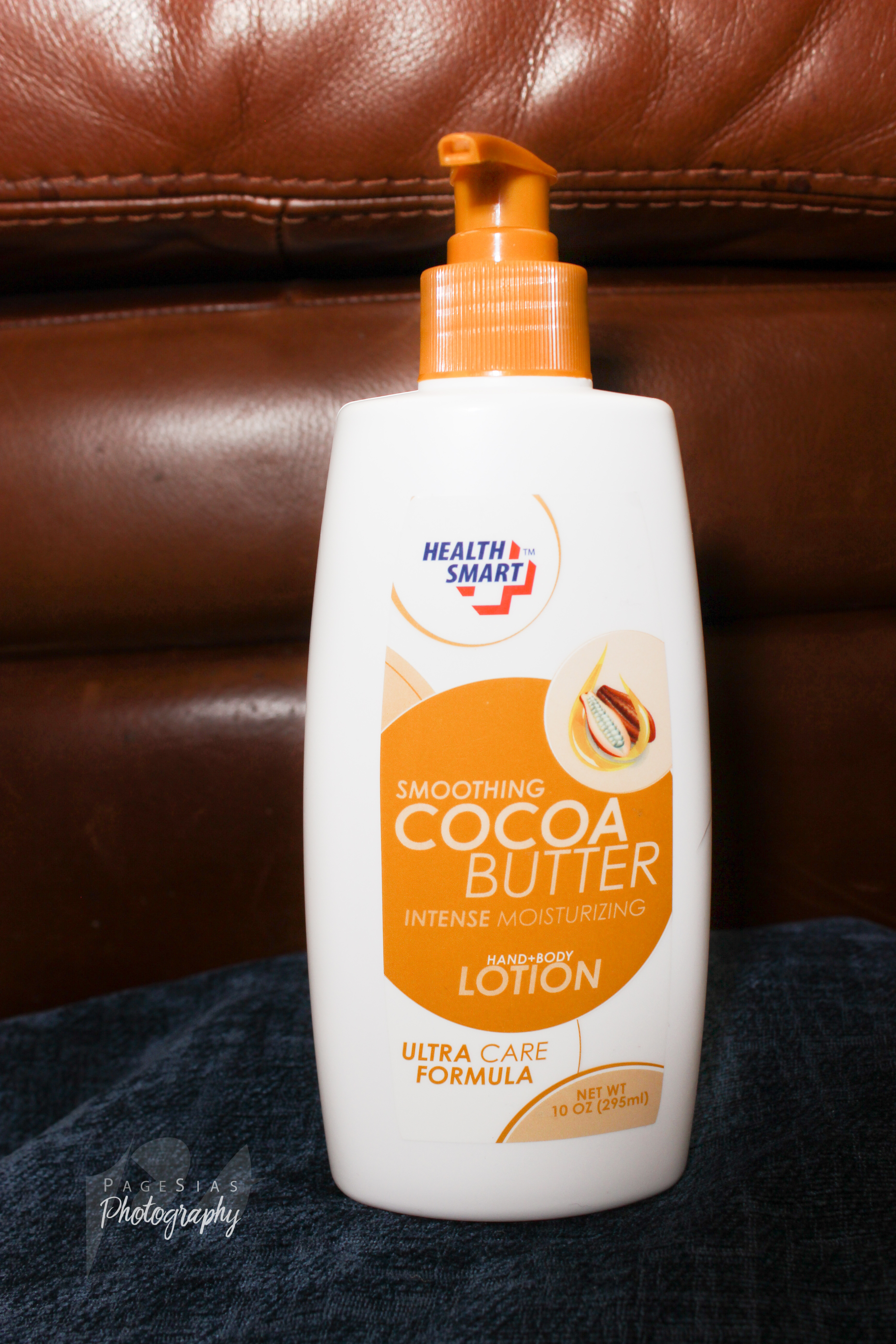
I’ve never understood why even small companies who make knock-off products don’t put a little effort into their packages. When it comes to luxury items like lotions, the package design is a huge part of the consumers decision to buy the product. So I decided to design my own lotion bottle, something I’ve been wanting to do for a while now.
Cocoa Butter is a specific kind of lotion that provides a lot of moisture to the skin and is a specialty lotion. I wanted my packaging to show that it was a specialty product rather than something you’d see on every shelf. I also know that cocoa butter is typically used by women so I decided I would incorporate a little femininity into my design.
Getting Inspired
The first thing I did to get inspired was to look at items on the shelves that caught my eye and figure out why I noticed them over others. I was drawn to colored bottles, glass bottles, matte finishes, bottles using a color scheme and ones that weren’t too busy.
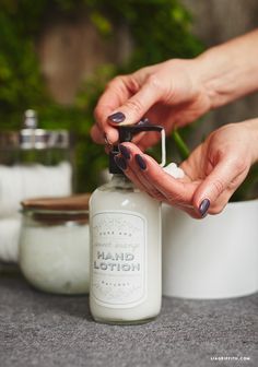
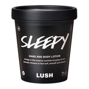

Then I went to Pinterest and found photos of lotion bottles that caught my eye and I thought looked nice. They are above. Again, I was drawn to glass bottles, matte finishes and colorful bottles with tasteful color schemes.
The Big Decisions
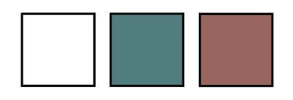
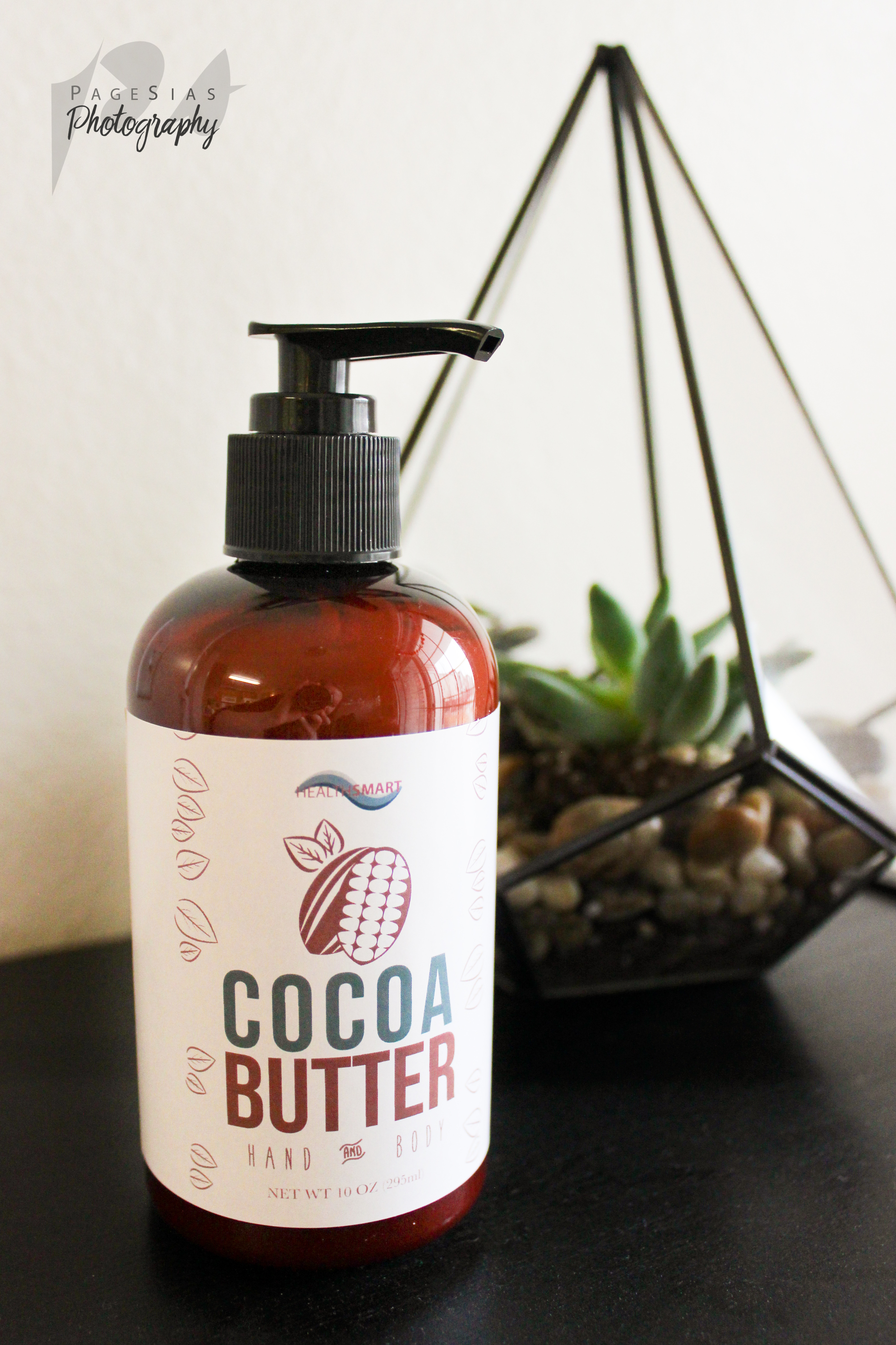
The first thing I knew I wanted to do was give this product a new color scheme. The yellow-gold was not screaming cocoa butter to me. I immediately decided that I wanted to incorporate some kind of chocolate brown color. I ordered brown bottles to bring that chocolate color in. I then decided on a lighter brown for most of my text and a teal to make certain parts pop! I also have white details on my design.
Another thing that I disliked about the original design was that the logo was not cohesive with the design or color scheme of the rest of the bottle. So I decided to create a new, simple logo. I made a logo using different colored swirls that reminded me a bit of lotion and other hygiene products. I made them a monochromatic color scheme and put the brand’s name on top. Simple, and fitting with my color scheme. 
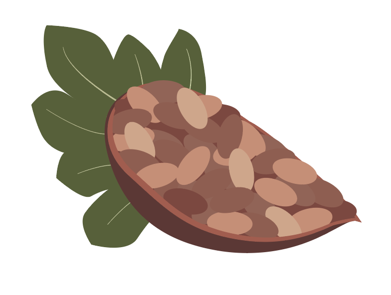
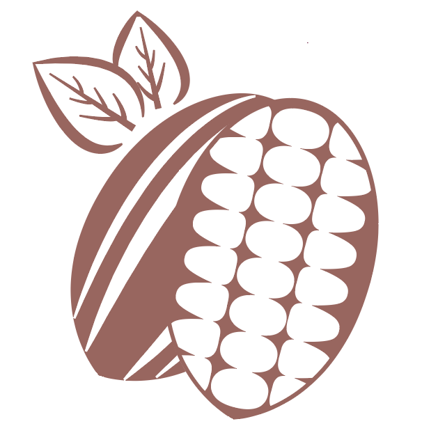
Next, I got to work on my cocoa bean. I knew I wanted a graphic of my cocoa bean on my package but I wan’t sure what they looked like. So I looked at some photos and created a vector of a cocoa bean. After getting some feedback on the graphic on the left I knew I needed something simpler. My cocoa bean was pretty busy and the color of the leaves clashed with the rest of my design. I came up with a much more basic idea, on the right.
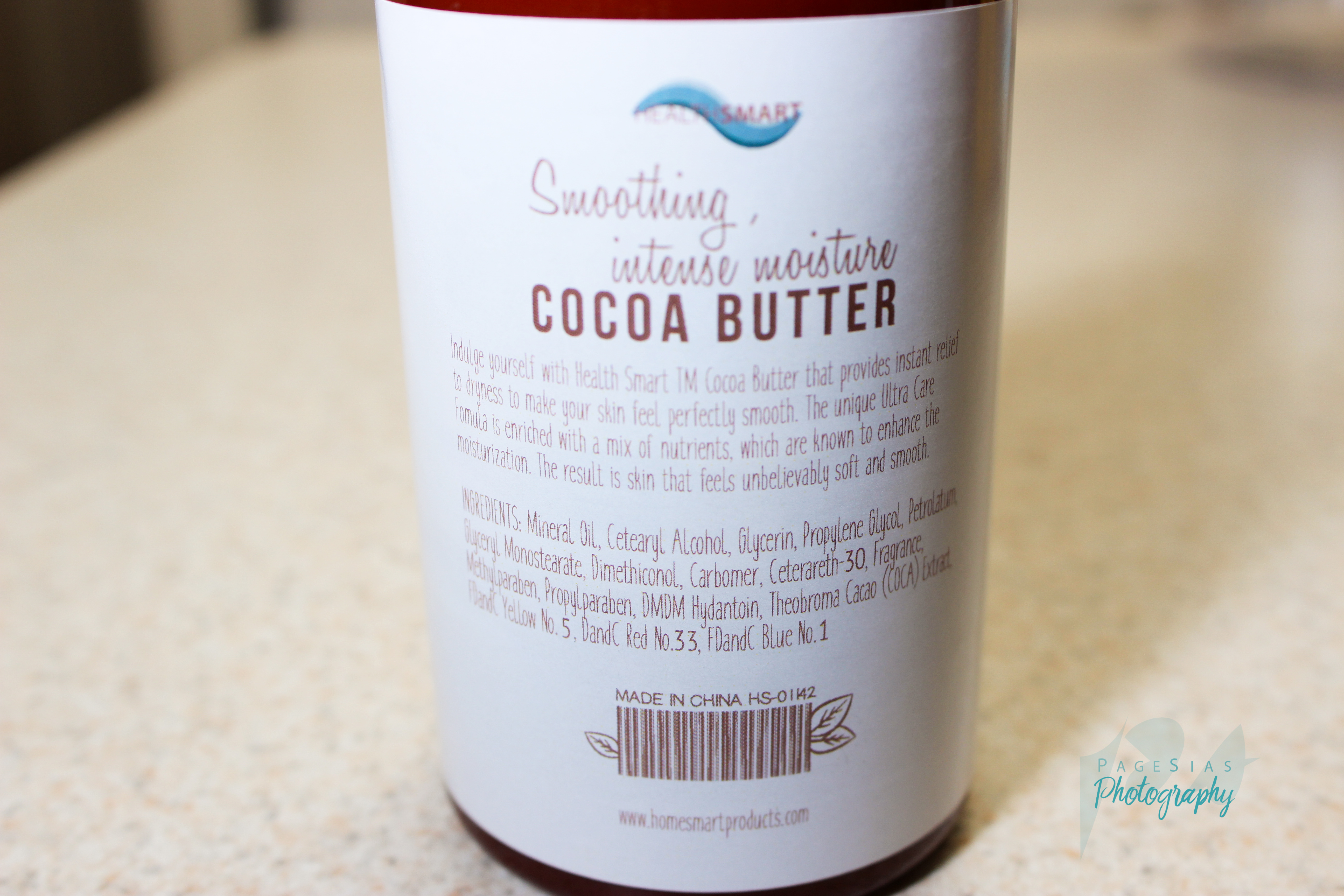
The rest of the design was pretty simple and straight forward. I gave “Cocoa” the pop of color to attract the eye and made it and “Butter” a big bold font so they could be easily seen. “Hand and Body” went underneath in a font that looked a little handwritten. That gave it a more feminine look. I continued the handwritten font on the back with the block letters as well.
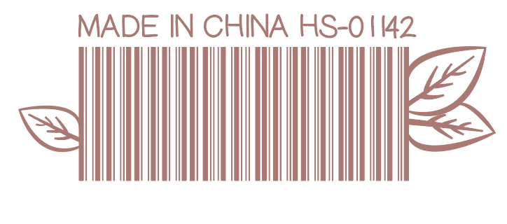 I wanted something simple for my barcode decoration because my bottle is so small. I knew if I tried something intricate, no one would see it because of the size of the sticker. I decided to add a few leaves from my cocoa bean graphic to tie it together.
Putting It All Together
I put my logo at the very top so that it would be easy to find but not the focus of my bottle. I put the cocoa bean under it, centering it and following up with “Cocoa Butter”. “Hand and Body” was just below that with the net weight at the very bottom. I used a similar centering method for the back of my bottle as well.
Late in the game I added on the leaf graphics you will see below. They are just a little something to frame my design.
Construction
I planned on printing on an opaque sticker that would just have my design on it rather than a color and my design. But I found that the opaque stickers that I had access to wouldn’t cut it on my dark bottle. So I went with the next option that I liked, a simple white sticker that gave my bottle a lot more contrast than I originally planned, but ultimately loved.
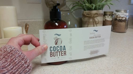
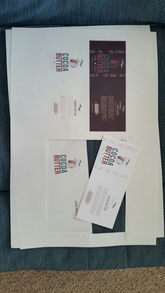 I printed at Alpha Graphics using their glossy sticker paper. I was able to print 4 to a sheet so I did that. I printed a white version (which I ended up liking the best on my bottle) and a brown version. The first step was to measure and cut them out with the backing still on.
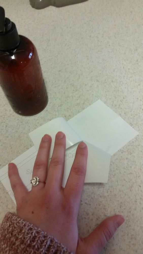
I found a flat, clean surface to apply my sticker and got to work. Trying to get the sticker on the bottle straight was the trickiest part. I really just got lucky eyeballing it. My bottle also had lines going down the sides that I used to line up the edge of the sticker. I peeled off half of the sticker so that I had a sticky part and a part to hold on to.
Then I lined up my sticker with the bottom of the bottle and the line on the side. I stuck the edge on the bottle and placed the stuck side on my flat surface. I rolled the sticker onto the bottle so that there wouldn’t be any air bubbles inside. And it was finished! It took a couple of tries to get it right, I assure you.
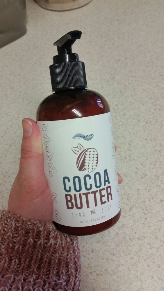
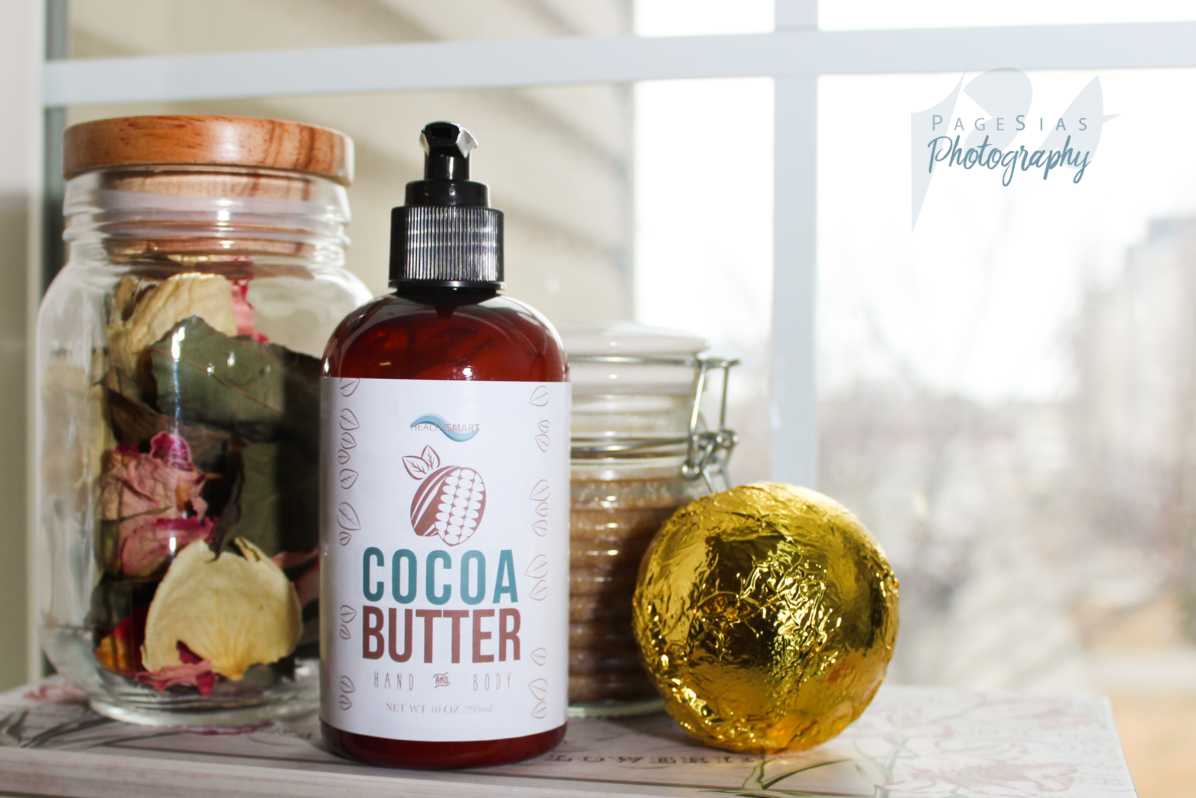
Below is the end product.
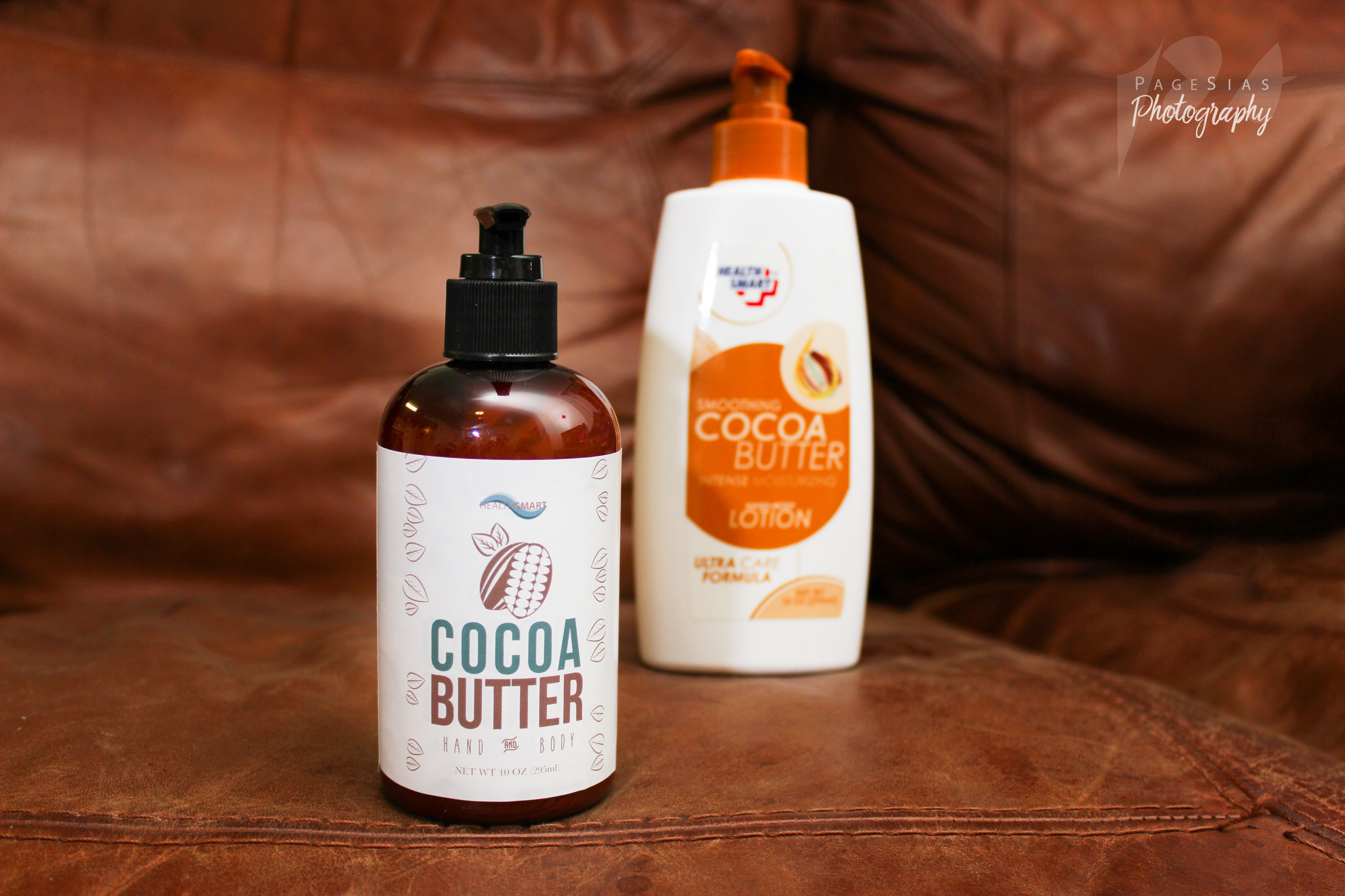
The new version v. the original, a bit of a side view, the back, and with other beauty products.
Let me know what you think in the comments below!
Read the PDF pitch book below for reasoning behind the decisions made in this product redesign.
Coco Butter Pitch Book by Page on Scribd
Page,
I love the new label and bottle. I would totally buy that over the original one! I also love your photographs! Your creativity continues to grow with each project you post! Good job my dear!